Loading video
Microlog
Designing smarter payments.
Strategy
design
Motion
UI/UX
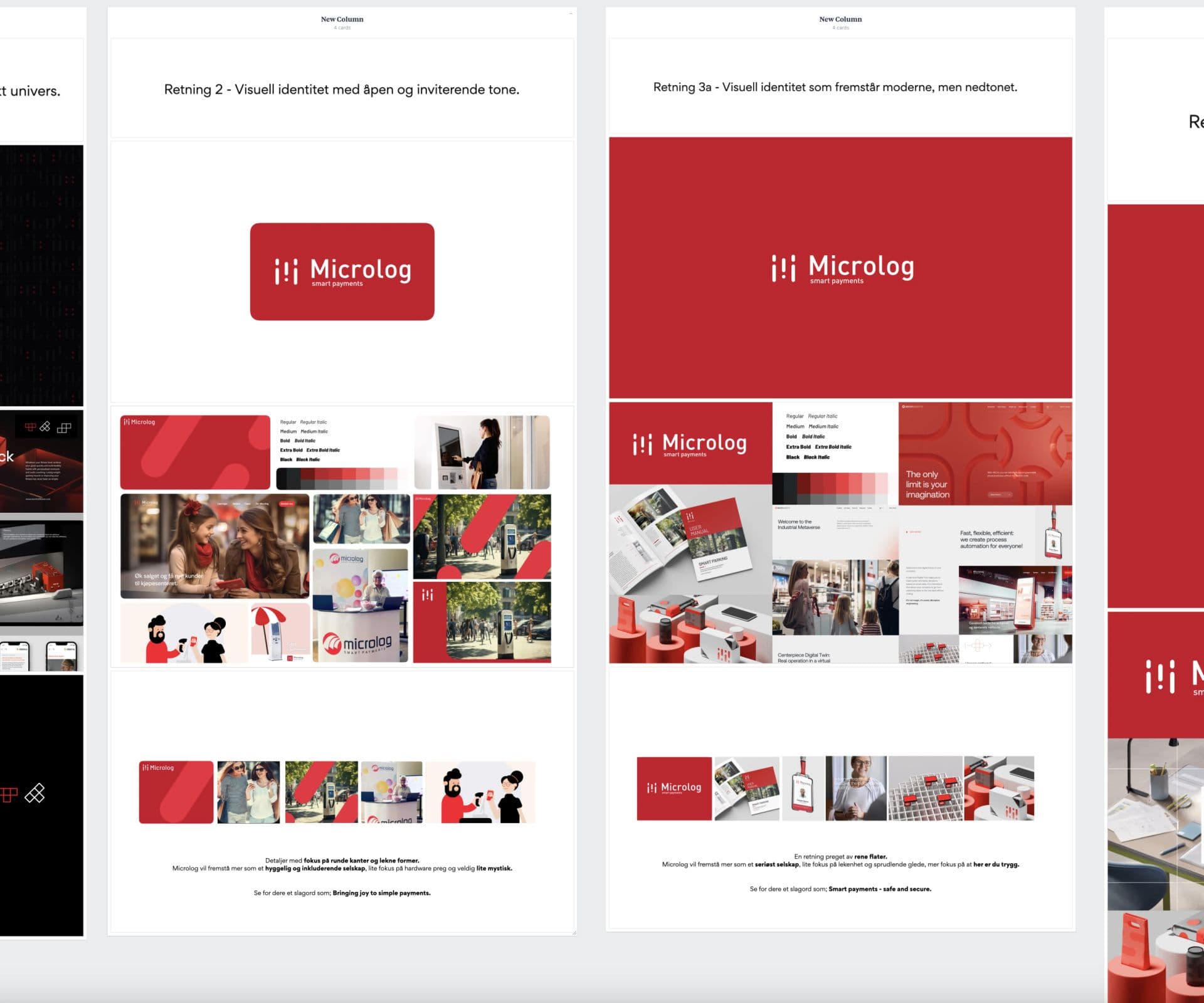
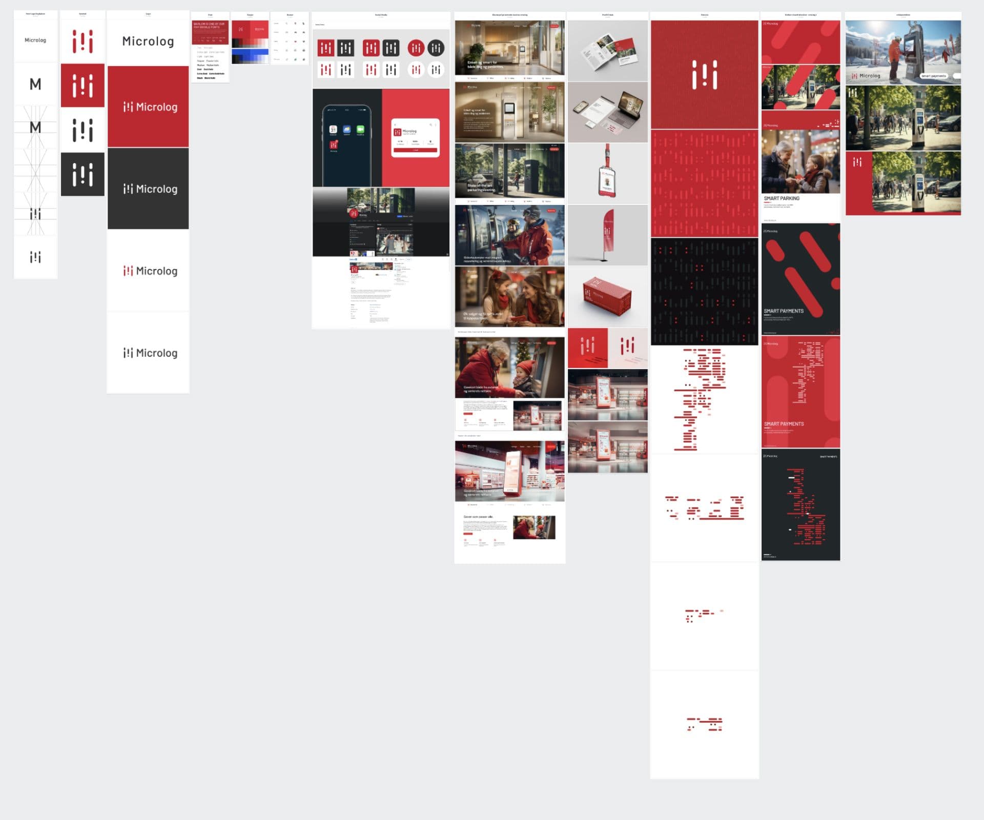
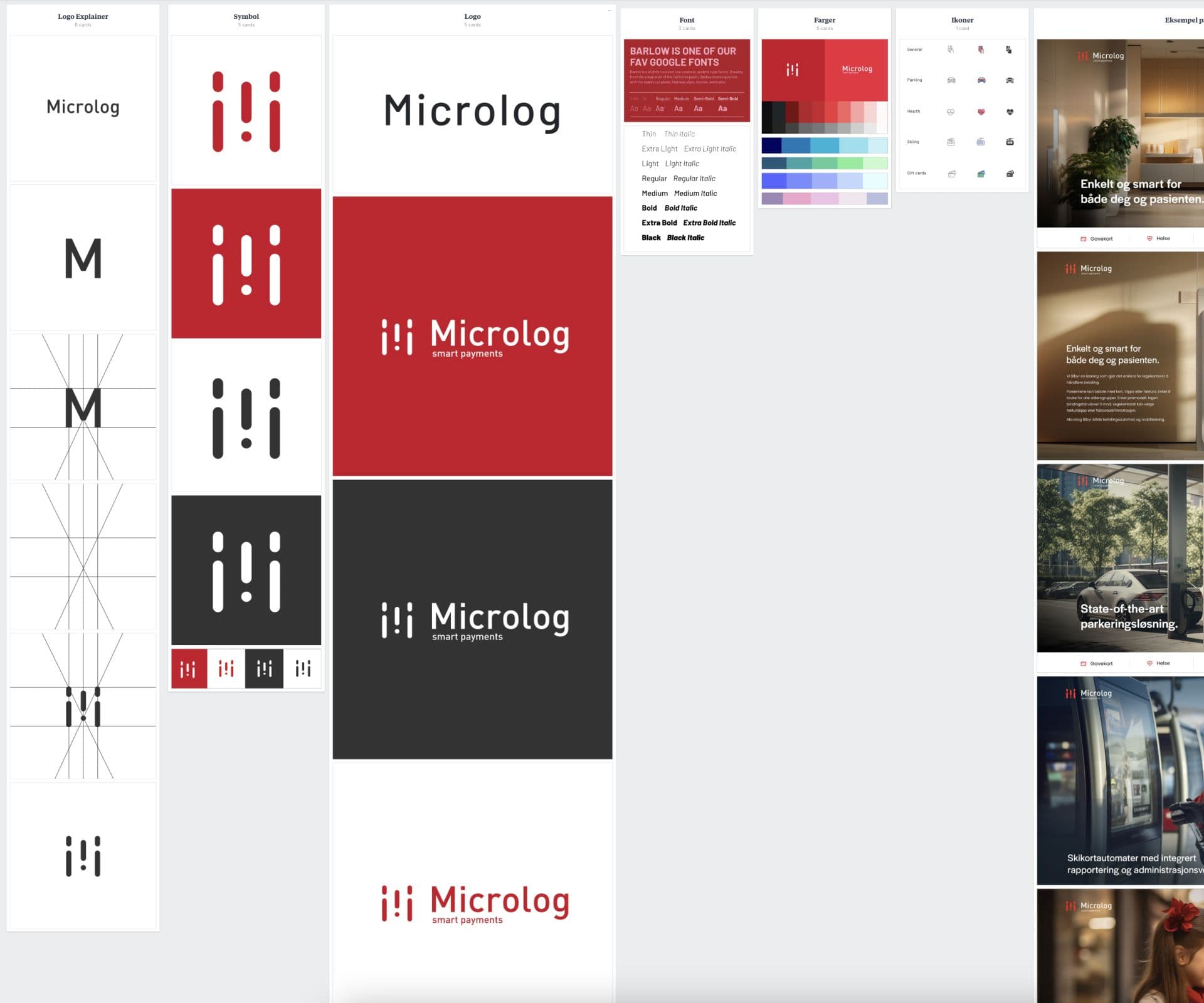
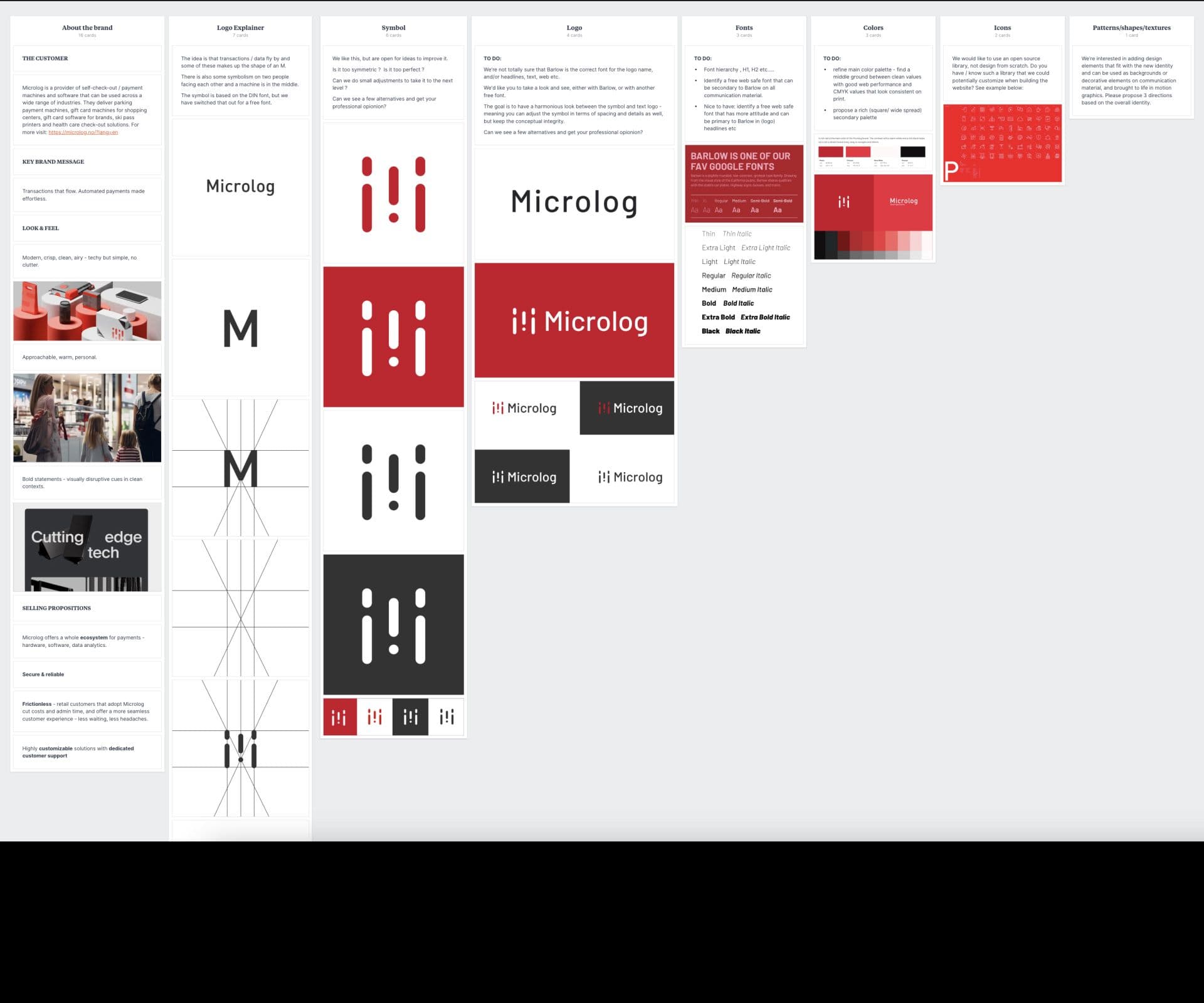
Microlog is a tech company specialicing in smart payment and self-service solutions for sectors like retail, healthcare, and hospitality. Their offerings aim to streamline payment processes and enhance customer experiences. We transformed their visual identity, building a cohesive brand with a new logo, color scheme, typography, 3D visuals, website, and media assets—all organized for easy implementation, empowering Microlog to present a unified, modern look that reflects their innovative approach.
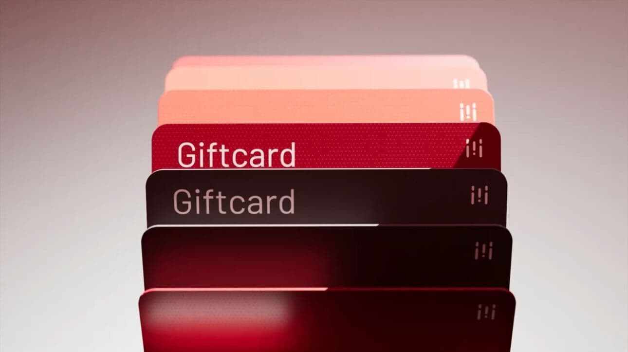
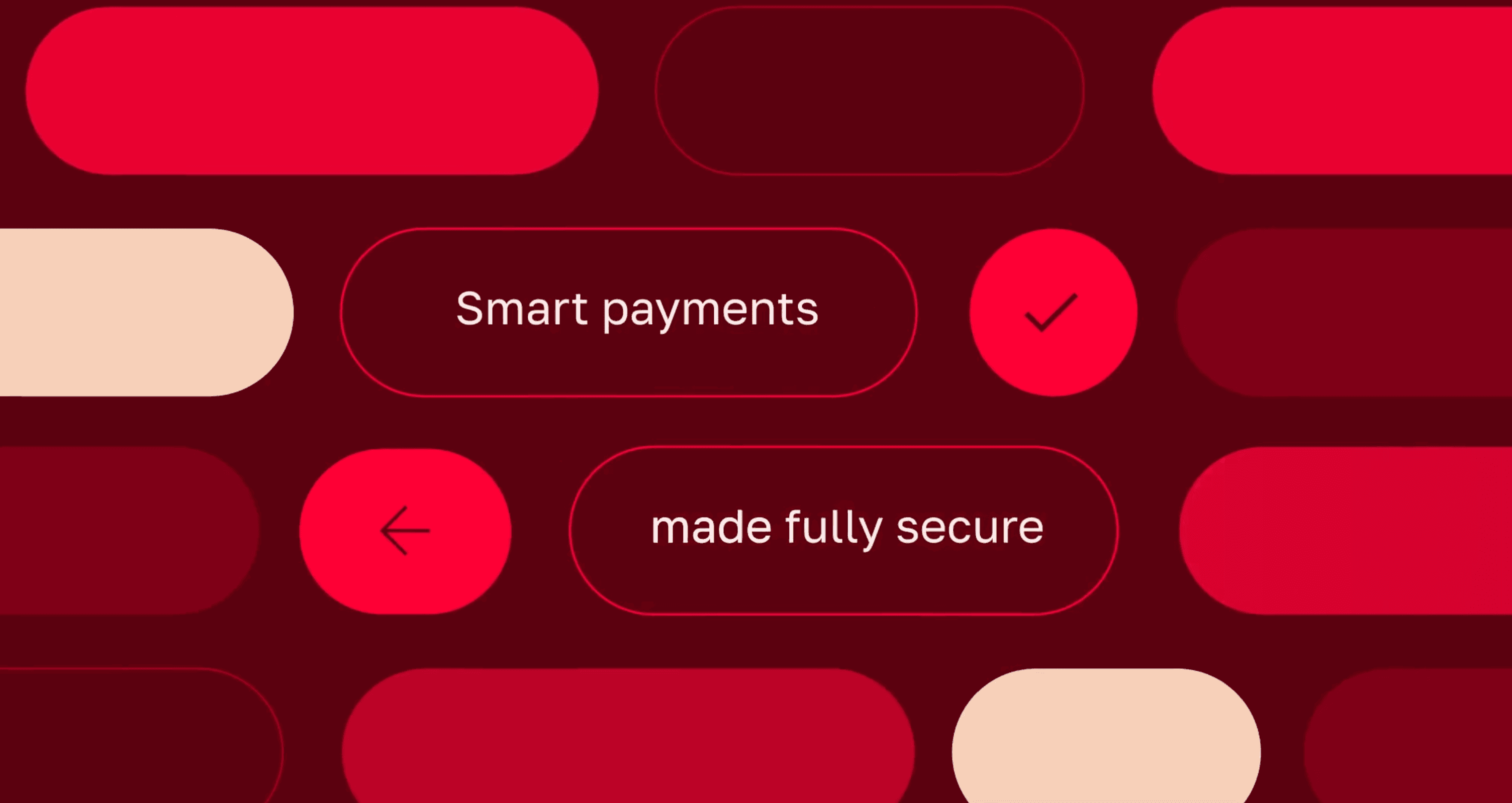
Microlog’s brand focuses on the seamless flow of data and transactions, emphasizing movement and connectivity within spaces. The digital connection is also made present in the motion identity language following a holistic approach for the whole visual identity from logo, type and colors, to motion, 3D and SoMe.
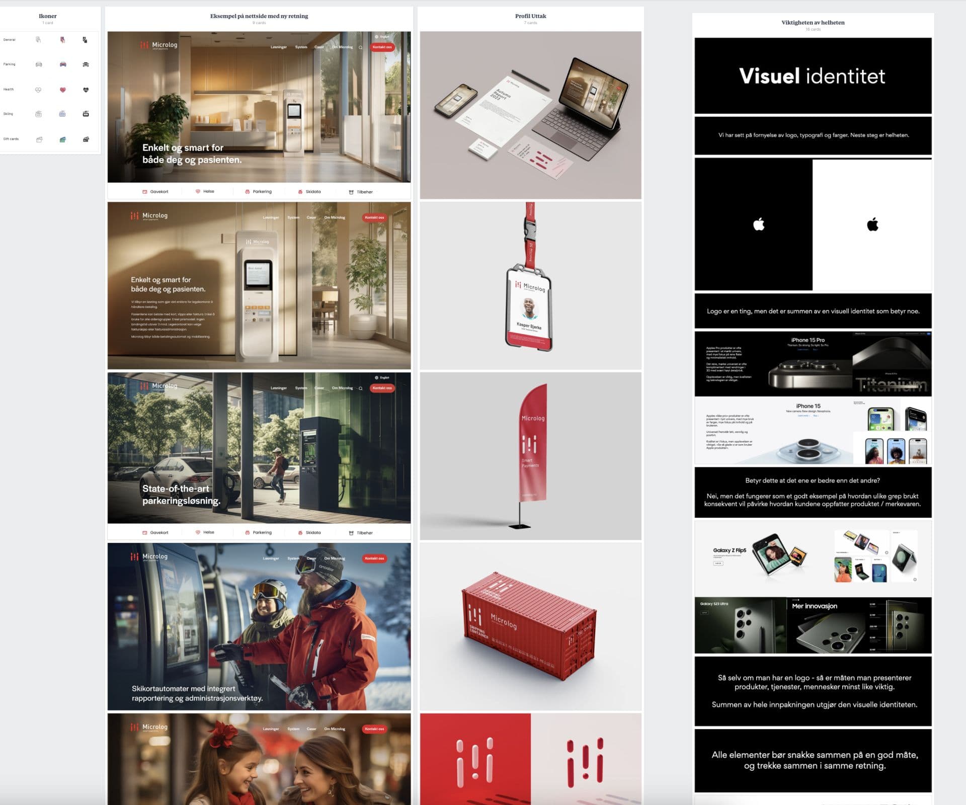
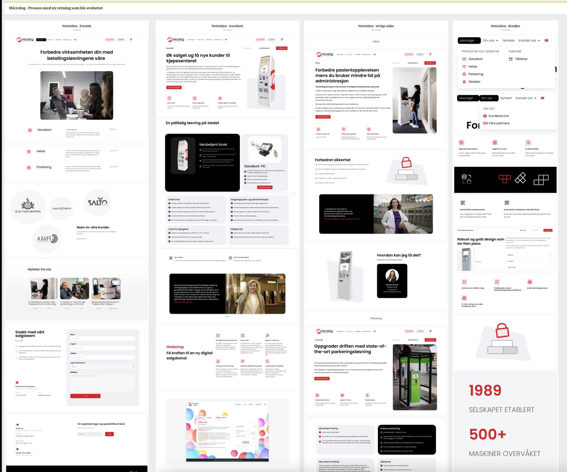
Microlog’s website is a central platform for communicating their services, so we rebuilt it from the ground up. We then extended this new visual direction to their portal, creating a cohesive and accessible user experience.
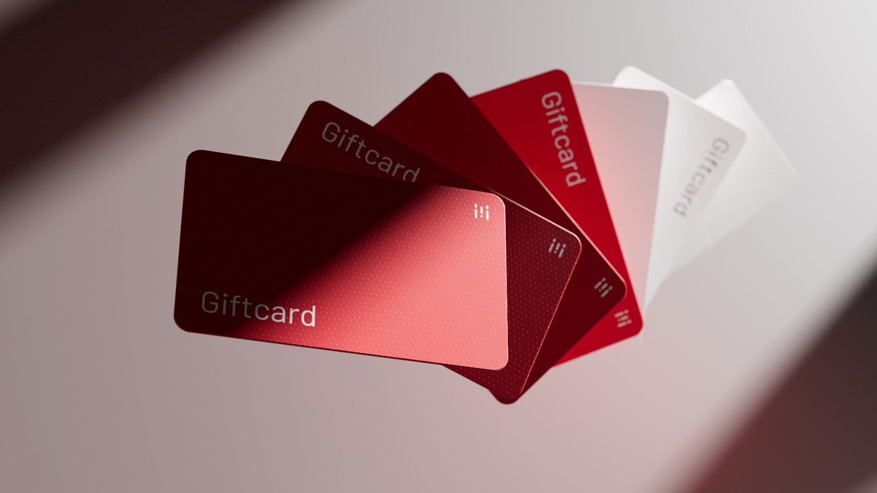
A consistent visual presence across all media through well-designed templates, a curated asset library, and clear brand guidelines. Maintaining a unified, professional look in every application, ensuring the brand stays recognizable and cohesive across all touchpoints.
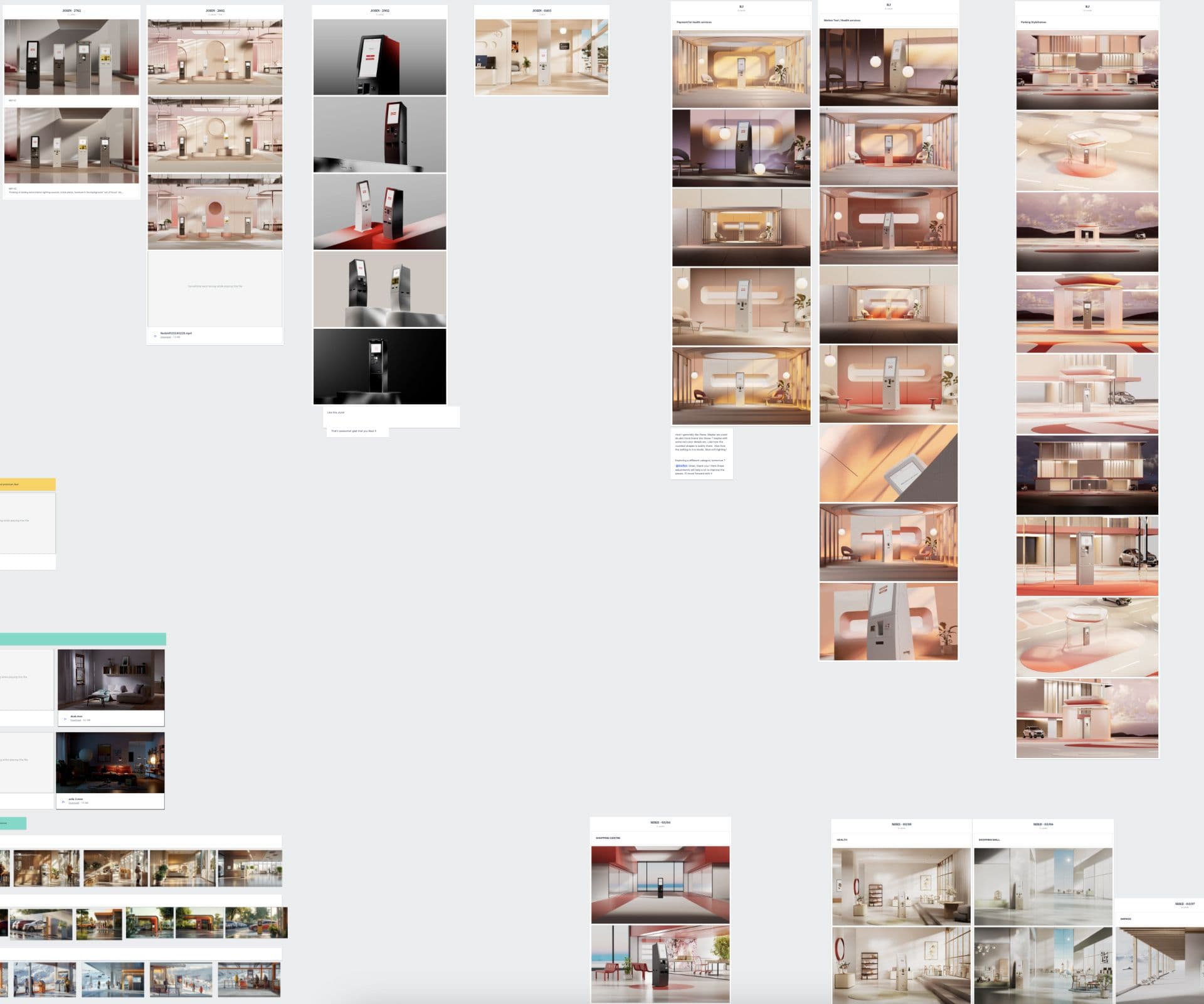
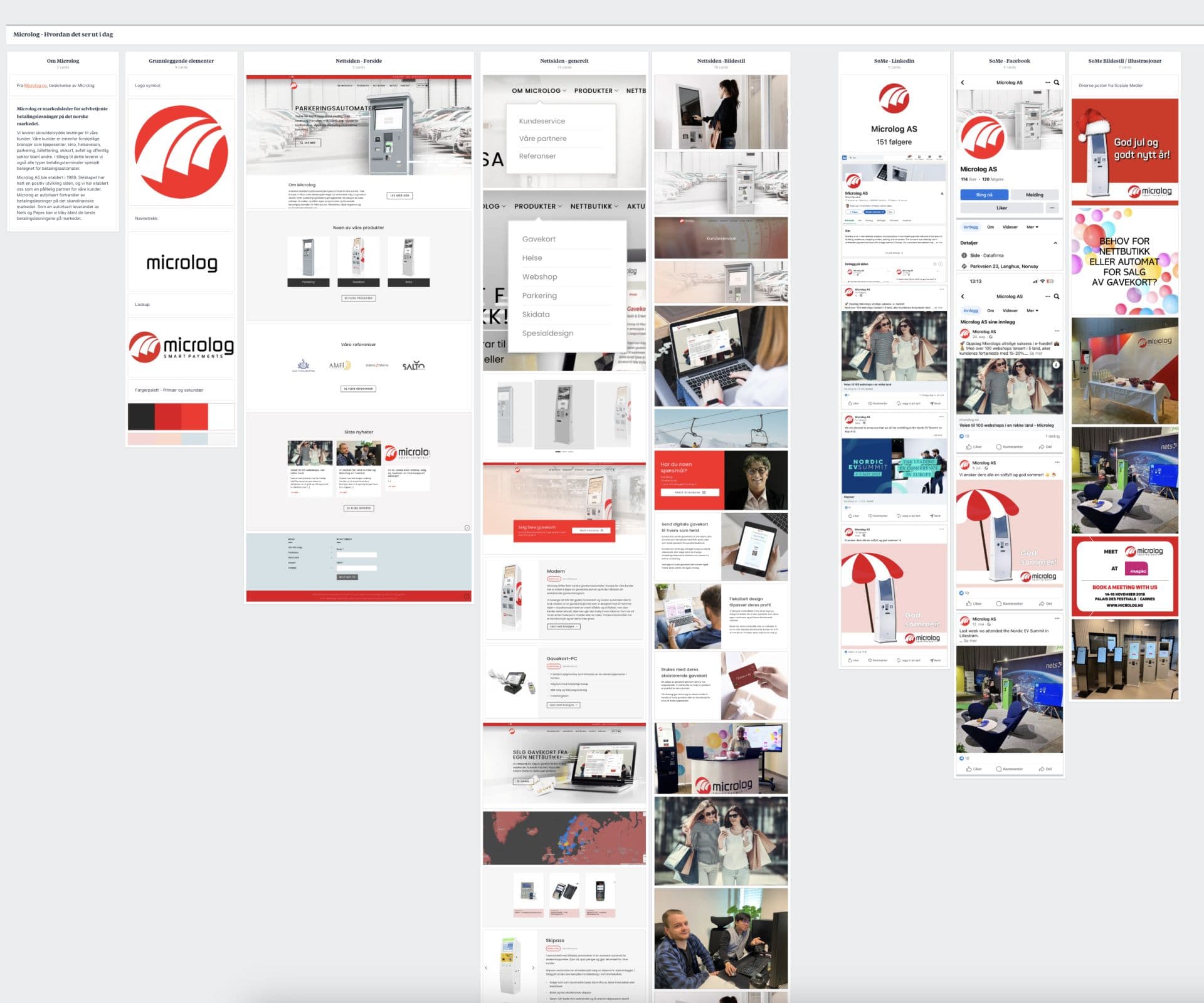
Process and explorations
